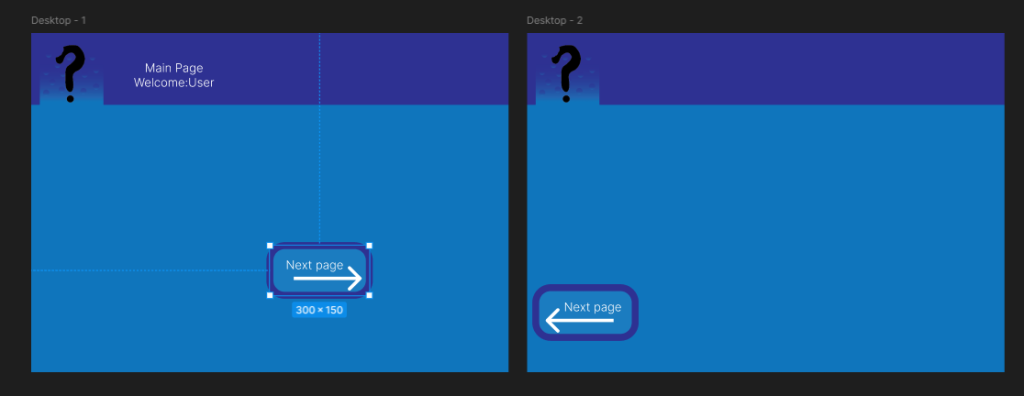
Here i planned out how the front page would be structured, this design was made after the decision that the crafting page would be changed to a news page. Most aspects of this design were kept however the main bar at the bottom had to be changed.
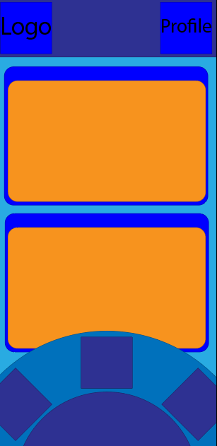
Here is where i first considered the color pallet as well as the size of icons when working with the web version. I also experimented with some basic mechanics like navigation between pages and how they should interact. Here i decided that the style for animation when going between pages would be pages coming up from below to fill the screen and when returning the animation would tuck away that tab
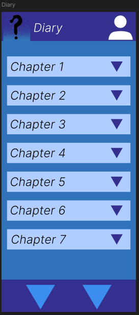
When designing the Diary at first i only wanted to have it split only by chapters, however the way the games are structured with their story it would be more user friendly to also split them by game as it would be easier for the user to read up on the story.